Being aware of the different types of website widgets requires knowledge. Understanding how to use them effectively? That’s widget wisdom.
When done correctly, widgets enhance the customer experience in a way that’s interactive, personalized, and relevant—all while feeling like a seamless extension of your brand. The placement, timing, frequency, and functionality can make or break your visitors’ impression of your site. Choices like when to show a pop-up vs. a slider or when to show a coupon code have a big impact on your bounce rate and conversion rate.
Let’s break down the various types of widgets along with some use cases and best practices. Jump to the spot you’re looking for below or read on to become a widget whiz.
Website Widget Locations
There’s no limit to where you can place widgets on your website, but there are 4 main Widget Types in Digioh: Lightboxes, Sidebars, Banners, and Inline widgets.

Lightbox Widgets
Lightbox widgets, also known as pop-ups or overlays, are versatile and impactful. Lightboxes demand attention by appearing over the site content. They’re great for delivering a welcome message to first-time visitors or sharing a coupon to a user that’s about to exit the site—just to name a few opportunities.
Digioh Lightbox Quick Facts:
- A pop-up widget that is centered over the screen
- Responsive design automatically scales to fit inside the window
- Background overlay (color, gradient or background image)
- Closes when user clicks X, “No Thanks,” or clicks outside of the box (optional)
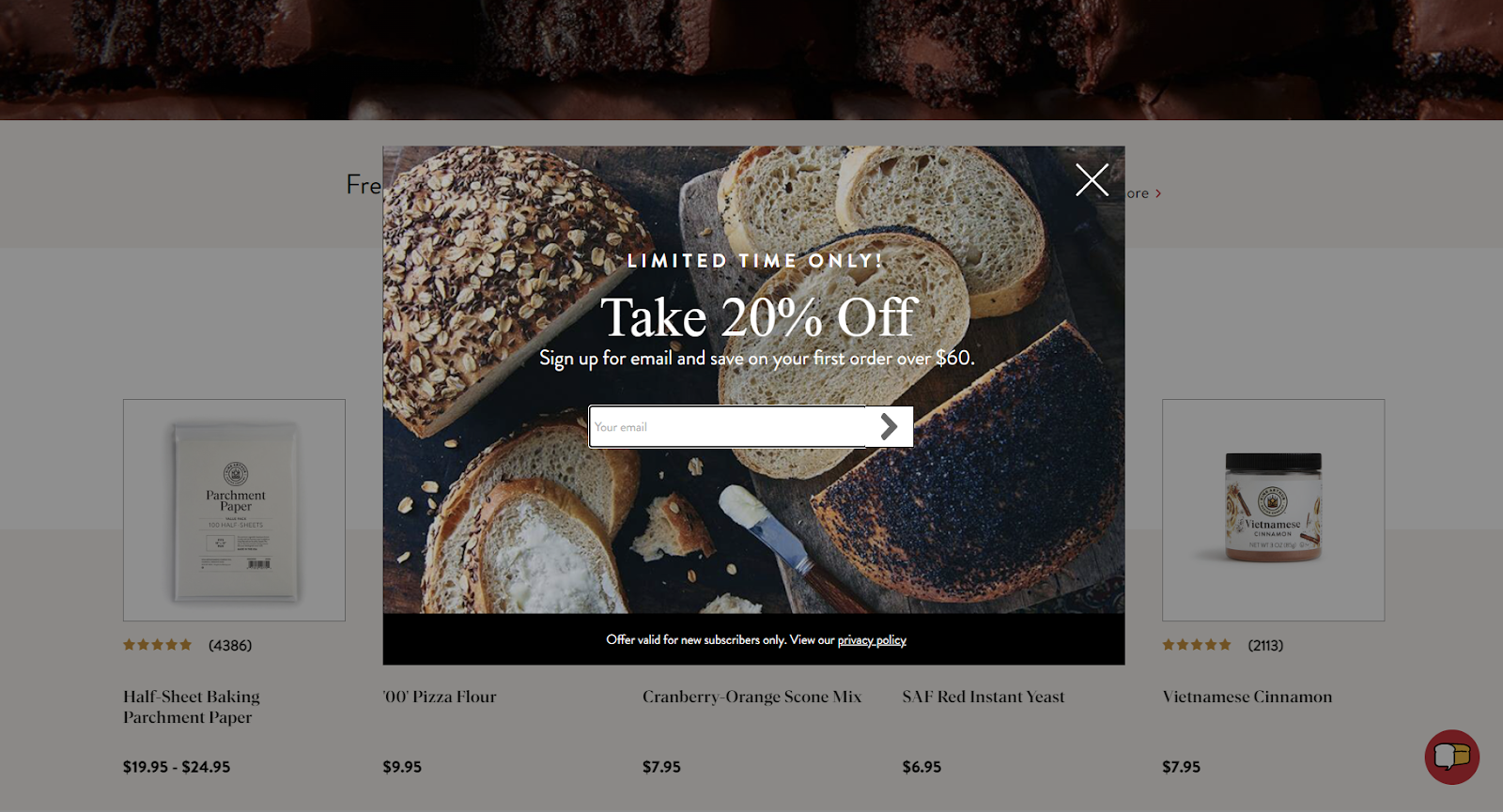
Popular Lightbox Uses Cases:
- Welcome Message for new users
- Coupon or cashback promotion
- Grow your email + SMS lists
- Recommendation Quizzes
- Cart Abandonment and Exit Intent pop-ups
- Full-Page Takeovers
What Makes the Lightbox Unique: Lightboxes can grab a user’s attention by taking center stage on your site. They’re impossible to ignore and deliver a strong message. But be careful; use lightboxes sparingly and responsibly to avoid fatiguing your visitors. Make sure you set up custom rules so visitors don’t see the same pop-ups repeatedly or get asked to sign up for a newsletter they already receive.
Sidebar Widgets
A sidebar widget—sometimes called a slider—is similar to a pop-up, but generally more subtle. They can be a small, unobtrusive pop-up teaser, or take up a significant portion of the screen like a drawer widget.
Digioh Sidebar Quick Facts:
- Slides out from the edge of the screen
- Choose between responsive scaling or scrolling
- Can appear top, left, bottom, right or centered (most popular placement is left, center)
- Appears over content on the page, but not usually with a background overlay
- Close button recommended
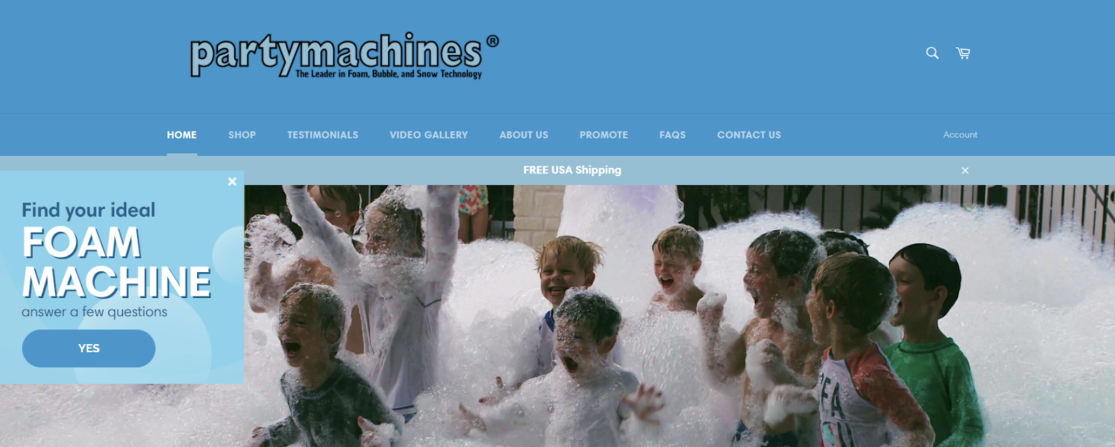
Popular Sidebar Uses Cases:
- Promote a larger lightbox that opens on click
- Offer a dynamic coupon based on current category page
- Invite visitors to take a quiz
- Newsletter Signup
- Redirect to another page
- Google compliant mobile pop-up alternative
What Makes the Sidebar Unique: Unlike lightboxes that block your content, sidebars sit to the side of it. Visitors can interact whenever they’re ready, without having to close the box to keep reading or browsing.
Inline Widget
Inline widgets are embedded directly within your content, making them a seamless part of your website. You can insert them anywhere—within the body of your text, into your main nav, in your footer, on your product page—anywhere.
Digioh Inline Quick Facts:
- Embedded directly on any location on your website
- Can appear on every page, or targeted to specific URLs
- Blend seamlessly with your site content
- Edge to Edge design to fill any page width
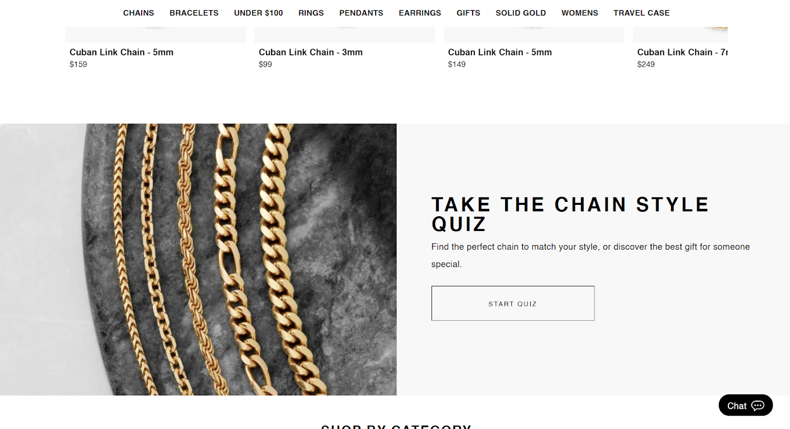
Popular Inline Use Cases:
- Quizzes
- Inline Forms
- Conversational Forms
- Targeted Hero Section
- Footer Newsletter Signup
What Makes Inline Unique: Inline Widgets let you add interactive elements to your website seamlessly as part of the content. Not only can you capture data through forms and quizzes, you can add dynamic content to any page or section of your site, creating a custom experience for each visitor.
Banner Widgets
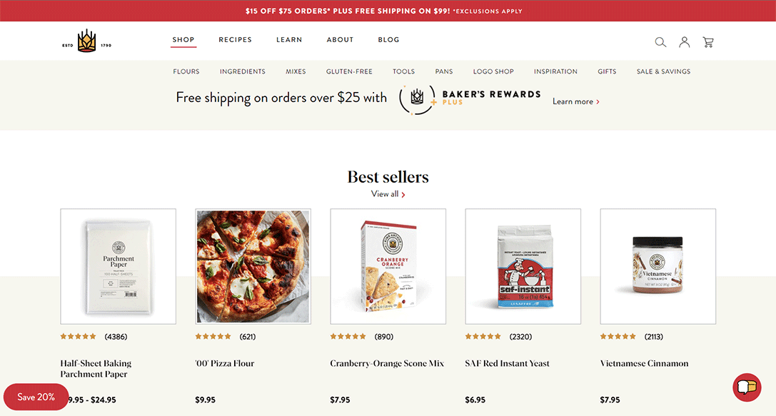
Banners typically appear at the top of your website, but you can also place them at the bottom of the page. Banners can be fixed or sticky, remaining visible as you scroll. Website banners are usually present on every page (although they don’t have to be!) to show important information and enticing offers.
Digioh Banner Quick Facts:
- Can be placed at the Top or Bottom of the page
- Usually 100px tall (or shorter)
- Choose between responsive scaling or an Edge to Edge design
- Appears above or below the content
- No overlay background
- Close buttons are optional
Common Uses:
- Announce site-wide sales
- Countdown timers
- Show a free shipping threshold
- Geo-targeted shipping messages
- Offer a dynamic, one-time use coupon
- Make an important announcement
- Display a CTA (like a webinar signup)
- Match retargeting and email messaging
What Makes the Banner Unique: Banners are subtle but effective. They’re (usually, in the case of top banners) the first thing a visitor sees, and reinforced with every new page a user visits. That consistency makes them hard to ignore without disrupting browsing.
Optimizing Mobile Widgets for Google
If you’re wondering when to use sidebar widget instead of a pop-up, Google has the answer. No, we don’t mean Google it—read their guidelines!
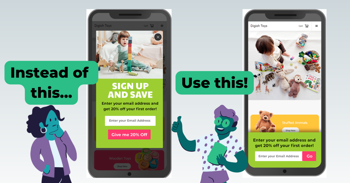
To avoid being penalized in Google search rankings, make sure mobile pop-ups don’t cover the entire site on the first pageview. Instead, use a small teaser at the bottom that only covers a small portion of the screen. Alternatively, you can make sure that pop-ups only appear on the second or third page a user visits and still stay compliant.
Widget Types and Use Cases
In addition to widget placement options, there are tons of widget use case types with different rules, behaviors and tactics you can apply.
Here are some popular widget types:
- Email & SMS Sign-up
- Offers and Promotions
- Forms
- Download Widgets
- Event Registration
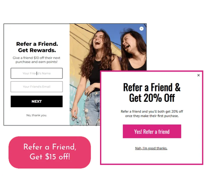
- Refer-a-Friend
- Exit-Intent
- Countdown Timers
- Out-of-Stock Notifications
- Calculators
- Quizzes
- Video Embed Widgets
- Maps and Location Widgets
- Book a Demo / Calendar Widgets
- Teasers
- Paywalls
- Surveys
Let’s go through some of the most common goals we see and when to use when widget in each situation. Note that in most situations several widgets can be used in different ways for the same objective!
When you’re promoting a sale or offer…
- Use the banner to grab attention while a visitor is browsing. For example, if you have a limited-time sale, the banner widget can display a bold message like "50% Off All Dresses - Shop Now!" The banner stays visible while allowing users to navigate the website.
- Use the lightbox to capture attention at a key moment in a customer’s journey, make a strong first impression for first time visitors with a Welcome Lightbox, or display an Exit-Intent lightbox with a coupon code to visitors leaving the checkout page.
- Use the inline to seamlessly show a promotion within your webpage's content. To promote a specific product line, you can create an inline widget and embed it right on your homepage. The benefit of doing that through a widget is you can add conditional logic to personalize the message, or turn it off at a specific time.
- Use the sidebar to provide a persistent call-to-action throughout the browsing experience. For example, the sidebar can promote your current sale with a sticky element that remains visible as users scroll. It could show a brief message like "Save 20% on Your First Month - Sign Up Now!" encouraging users to take advantage of the offer. The sidebar might open a lightbox with a coupon code or a landing page with more details. When you close the lightbox, the teaser will re-appear, making it easy to pull up the offer again at any time!

When you’re promoting or showing a quiz…
- Use the banner to create curiosity and encourage participation. For example, if you're promoting a quiz to determine your ideal vacation destination, the banner can display a captivating headline like "Discover Your Dream Vacation Spot - Take the Quiz!"
- Use the lightbox to redirect users to take a quiz, or even show the quiz inside a lightbox. These interactive widgets are especially useful if your quiz is designed to answer a question like “what’s my perfect size?” without redirecting them away from the product page.
- Use the inline to embed a quiz seamlessly within your website content, landing page, or blog post. For instance, if an article lists "Top 10 Books of 2023" and you want to incorporate a quiz that shows readers which book they should buy, an inline widget can display each question and the corresponding options within your content without requiring visitors to leave the page.
- Use the sidebar on your homepage or popular landing pages to boost quiz engagement.
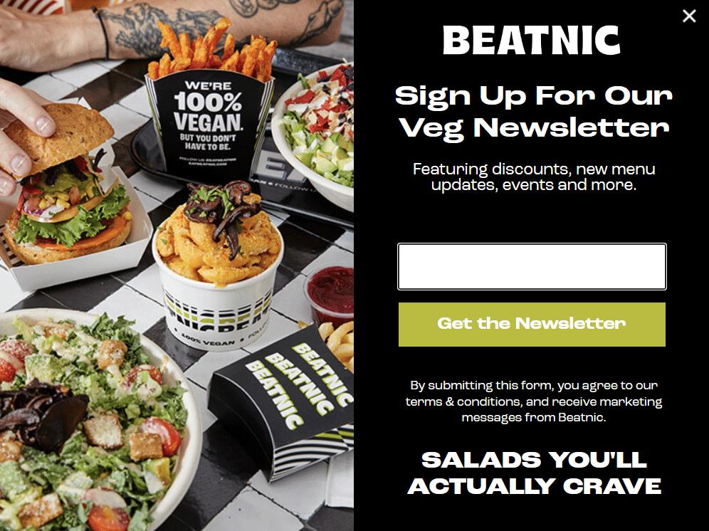
When you’re growing your newsletter list…
- Use the banner to highlight the benefits of subscribing to your newsletter. For example, the banner can display a compelling message like "Join Our Exclusive Community and Get Access to Exclusive Discounts and Insider Tips!" The banner invites visitors to subscribe and stay informed.
- Use the lightbox to capture visitors' attention, offer a free download, and allow them to complete their sign up all on the lightbox form. For instance, your timed lightbox can pop up after a few seconds, offering a valuable incentive like a free downloadable guide or a discount code in exchange for subscribing to the newsletter, and they can receive that code or download when the form is filled out.
- Use the inline to embed a newsletter subscription form within your content or as part of your site footer. For example, if you're writing a blog post about gardening tips and want to encourage readers to subscribe, you can use the inline widget to display a concise subscription form within the post, making it easy for readers to sign up without interrupting their reading experience.
- Use the sidebar to provide a persistent newsletter subscription option from page to page. For example, the sidebar can display a concise form asking visitors to enter their email addresses to subscribe. The sidebar can remain visible as users navigate the website until they close it or sign up.
Winning with Widgets
You can win with widgets when you know when to use which widget! (say that 5 times fast)
But seriously – we love talking strategy. A tool is only as powerful as your ability to use it to its full potential. And you deserve to reach your site’s full potential. Collecting and leveraging consumer-consented data is the most effective way to increase sales, personalize your site experience, and create relationships with customers who return again and again (and tell their friends).
Read more of our strategy resources, or book a demo to ask us your questions!
