May 5, 2026
Whether you use pop-ups to grow your list or recommend products, follow these design best practices to give your mobile visitors the best experience possible.
Steal High-Converting Ideas From Leading DTC Brands
Browse 50+ real examples of personalized marketing funnels you can replicate today.
Mobile site visitors now account for most ecommerce traffic, and it’s only becoming more dominant.
If your mobile popups, lightboxes, and banners were designed for desktop, you’re missing critical opportunities to identify visitors, capture zero-party data, and convert in the moments that matter most, especially when your popup campaigns aren’t aligned with real user behavior.
Well-designed mobile popups boost conversions by 15-35%. Poorly designed ones increase bounce rates, frustrate mobile users, and reduce user engagement, especially when immediate popups interrupt the experience too early. The difference between the two usually comes down to a handful of design and targeting decisions that are easy to get right once you know what to look for.
Whether you're using pop-ups to capture emails, grow your SMS list, reduce cart abandonment, or recommend products, this digital marketing guide covers the mobile-specific best practices across different devices that give your visitors the experience they expect in 2026.
Most teams start by shrinking desktop popups for mobile. That approach breaks quickly. A design built for a 16:9 landscape layout doesn’t translate to a vertical screen; it creates friction, limits visibility, and hurts mobile performance. Mobile pop-ups should be designed for portrait from the start, not adapted after the fact.
For wide or full-screen lightboxes, rethink the aspect ratio entirely for mobile. Instead of scaling a 16:9 desktop design down to fit a 375px wide screen, build a 9:16 version specifically for mobile. The layout, image placement, and copy hierarchy should all be reconsidered for vertical viewing and not just reflowed.

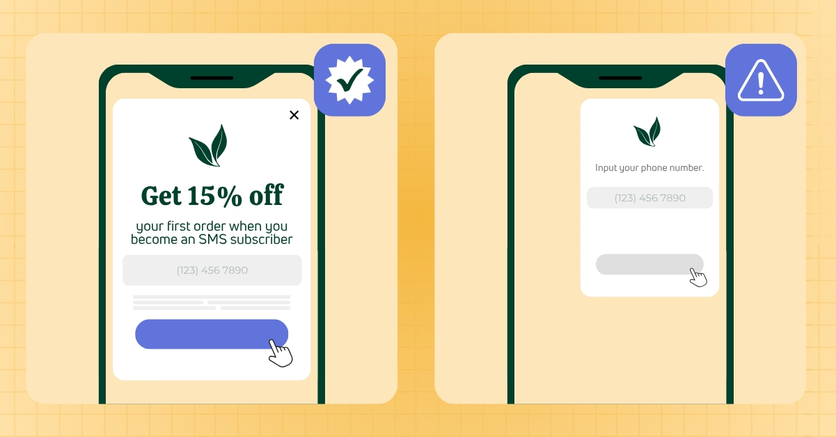
A common pattern: desktop pop-ups place the image beside the form in a horizontal layout. On mobile, that same content is restructured into a vertical stack, with the image above the form. Same elements, different structure, and the mobile version consistently converts better because it matches how users actually interact with their phones.
For instance, the pop-up example below displays horizontally on larger devices, with the image to the left of the form fields. When a user visits on mobile, the image changes, instead displaying on top of the form.

Screen resolutions vary across mobile devices, but a few safe guidelines will cover the majority of your visitors.
375x667px is a reliable maximum to design for, as many mobile devices render web content at this resolution. Designing for this size helps ensure your pop-up displays correctly across most mobile traffic without device-specific adjustments.

For extra safety on devices with curved edges or unusual aspect ratios, design to 360px wide and give yourself a margin on both sides. Content too close to the screen edge can get cut off on devices with curved displays — a small design decision that significantly impacts perceived quality.
In terms of height, limit pop-ups to 70% of the viewport height maximum. Covering the full screen creates a disorienting experience—especially with full screen popups, which can feel intrusive if not aligned with user behavior. Leaving visible background content reinforces that the pop-up is a layer on top of the page, not a replacement for it.
Critical interactive elements — buttons, form fields, close buttons — should be positioned in the bottom two-thirds of the pop-up where thumbs naturally rest on a phone. Tap targets that require reaching to the top of the screen create friction that costs you completions.
Google penalizes pages that display intrusive interstitials to mobile visitors arriving from organic search results—especially when immediate popups appear before any meaningful interaction or user behavior is established.
Specifically, pop-ups that cover the main content immediately upon page load, before the visitor has had any chance to engage with the page, are flagged as intrusive and can negatively impact search rankings.

For pages that receive significant organic search traffic, you have two compliant options:
A teaser is a small widget that sits in a corner of the screen and covers only a minimal portion of the content. Because it doesn't block the main page content, it falls within Google's acceptable formats. It also keeps your offer visible and accessible throughout the session without requiring the visitor to have seen a full pop-up first.
Show the full pop-up only after mobile users have navigated to a second page in the session. This approach complies with Google's guidelines because the pop-up isn't appearing on the page a search visitor initially lands on. You can design the full pop-up without restrictions — the timing is the compliance mechanism, not the design.
With Digioh's conditions editor, you can set rules that apply different pop-up logic to visitors from organic search versus direct traffic, paid campaigns, or email, so your compliance rules don't restrict your performance on non-search traffic.
Touchscreens limit precision. If buttons, form fields, or close icons are too small or too tightly spaced, mobile users tap the wrong thing. That friction quickly turns into abandonment.

For best practices, follow platform standards for tap target sizing:
Every interactive element in your mobile popups should meet these minimums: buttons, form fields, quiz answers, and close icons. When targets are too small or too crowded, mistakes increase, and completion rates drop.
Proper spacing reduces friction. In multi-step forms and quizzes where users make quick selections, clear separation between options leads to higher engagement and more completed submissions.
Mobile screens offer a limited screen space, so every word and every form field needs to justify its presence.
Copy: Focus on the offer and the action. What works on desktop often becomes a wall of text on mobile, and most users won’t read it. If your value prop isn’t clear in two to three short lines, the issue is the message, not the layout.

In many cases, less is more. Some of the highest-converting mobile optimized popups are just a clear offer—often a simple discount code paired with a single call to action. No image, no extra copy—just what the user needs to act.
Forms: Limit fields to what’s essential. Email is enough to capture the lead—adding extra fields reduces completion rates across mobile popups.
To collect more data, use a multi-step flow. Breaking questions into individual steps reduces friction and increases submission rates—especially when the value exchange (like a discount code) is introduced at the right moment.
This is a small technical detail with a disproportionate impact on mobile experience.
On iOS devices, when a form field has a font size smaller than 16px, the browser automatically zooms in when the visitor taps the field to type. This zoom behavior is disorienting — it shifts the layout, changes the visual context, and makes the form feel broken even when it isn't.

Set font size on all form field inputs to 16px or larger. This prevents automatic zooming, keeps your design intact when visitors interact with the form, and makes the text easier to read without requiring visitors to adjust their view.
On mobile, spacing directly impacts usability. Text and form elements placed too close to the edge are harder to interact with and can get cut off on certain screen sizes. That small detail creates friction and lowers completion rates.

Give your content room to breathe. Comfortable padding on left and right edges — typically 16-24px on each side — ensures your content is readable and accessible across the range of devices your visitors use. It also makes the overall mobile design feel more considered, which builds the subtle trust that keeps visitors engaged.
The difference between a cramped mobile pop-up and a well-spaced one is immediately apparent. Visitors may not consciously register why one feels better than the other, but the impact on engagement is real.
Screen sizes vary, so when the close button is hard to find or tap, the popup window disrupts the mobile popup ux, leading users to leave instead of engaging. That breakdown in flow directly impacts user engagement and reduces the likelihood of converting that session.

Follow these best practices when designing popups for close buttons on mobile:
Letting users close mobile popups easily preserves the session. Blocking that action drives abandonment—costing you engagement, identifiable visitors, and future conversion opportunities.
Typography: What looks good on a desktop doesn’t always work on a mobile design. Smaller screens amplify readability issues, especially with decorative fonts and lighter weights. If text isn’t immediately clear, users move on.

Reserve stylized fonts for large headlines. For anything users need to read or act on, use simple, high-contrast typography that’s easy to scan.
Strong contrast isn’t just about accessibility; it directly impacts performance. Clear, readable text on mobile devices keeps users engaged and increases the likelihood they will complete the interaction.
Ecommerce stores commonly use seven effective popup types on mobile, each suited to different key metrics:
Email signup banner popups — best triggered after scroll depth (50-70% of page) or time on page (15-30 seconds) rather than on immediate page load. Gives visitors time to engage with the page before prompting sign-up forms.
Cart abandonment full screen popups — exit-intent triggered on mobile via scroll-up behavior rather than cursor movement (which doesn't exist on touch devices). Most effective on the cart page and checkout page.
Product recommendation full screen popups — quiz-style experiences that guide visitors to the right product. Particularly effective on category pages where visitors are evaluating options. The multi-step format works well on mobile because it breaks the experience into single questions, helping convert visitors.
Countdown banner popups — urgency-driven formats for time-limited offers or low-stock alerts. Keep the copy minimal and the countdown prominent.
Upsell popups — triggered on the cart or checkout page to surface complementary products or bundle upgrades. Most effective immediately after add-to-cart.
Gamified trigger popups — spin-to-win formats that capture emails through an interactive experience. Higher engagement rates than static email capture pop-ups for cold traffic.
Feedback and survey popups — post-purchase or exit-intent surveys. Keep to a maximum of one or two questions on mobile. Multi-step formats with one question per screen perform better than single-page forms with multiple questions.
When used correctly, full screen popups can drive strong results, but only when they align with timing and intent.
Desktop previews don’t reflect real mobile behavior. What looks fine in a browser can fail once users start interacting.
Test every popup window on real devices. Open it, close it, complete the form—move through the full experience. This is where usability issues impact conversions.
To expand coverage, platforms like BrowserStack allow you to test across multiple real devices and operating systems without maintaining your own device library. Advanced platforms can also be automatically optimized based on real-time performance data.
Post-launch, use Google Analytics to monitor mobile-specific performance. Track completion rates, user clicks, drop off, and revenue impact. Comparing mobile to desktop highlights where your mobile popups are underperforming.
Measure mobile popup performance separately to understand how design impacts user engagement. Mobile and desktop users behave differently, and blended metrics hide where mobile popups are losing conversions.
Use Google Analytics to track:
Mobile click-through rate — The percentage of mobile visitors who click through from the pop-up to the offer. Low mobile CTR relative to desktop usually points to a design or copy issue specific to small screens.
Form completion rate — The percentage of visitors who start the form and finish it. Drop-off at the form stage on mobile typically indicates the form is too long, test readability is poor, the keyboard experience is poor, or tap targets are causing mistaps.
Bounce rate impact — Compare bounce rate for sessions where the pop-up was shown versus sessions where it wasn't. A well-designed mobile pop-up should not negatively affect bounce rate. If it does, look at timing and format first.
Revenue influence — Track revenue from sessions where a mobile pop-up was engaged versus sessions where it wasn't. This is the metric that justifies the investment in mobile-specific design; not just engagement, but actual conversion and revenue impact.
A/B test mobile separately from desktop. Copy, design, and timing changes that improve desktop performance don't always translate to mobile. Run mobile-specific tests to optimize for the touch experience independently.
Scaling down a desktop design is not a mobile strategy. Digioh gives you the tools to build genuinely mobile-first pop-up experiences — with separate design controls for desktop and mobile, responsive templates that adapt to screen size, and targeting rules that let you show different pop-ups to mobile and desktop visitors entirely.
With Digioh, you can:
Mobile isn’t a smaller version of desktop; it’s a different experience entirely. High-performing brands design effective mobile popup design strategies from the start, using best practices to attract engaging users.
High-performing brands account for that from the start. They align layouts, timing, and messaging to real user behavior, not assumptions. Getting layout, spacing, copy length, and timing right reduces friction and improves completion rates; when they’re off, performance drops across the board.
The path forward is straightforward: build for mobile first, test on real devices, track mobile metrics independently, and optimize based on performance. Done right, mobile popups become a reliable channel for conversions, increasing average order value, data capture, and user engagement.
Book a demo to see how Digioh helps ecommerce brands build mobile pop-up experiences that convert users into loyal customers.
Don’t settle for siloed tools. With Digioh, you get one powerful platform for pop-ups, product quizzes, onsite identification, and more—everything you need to personalize every step of the customer journey. Identify more traffic. Collect more zero-party data. Turn insights into revenue.
