May 5, 2026
Landing pages let you capture leads, launch products, grow your list and connect with audiences. Here are some of the best practices for building an effective landing page.

Steal High-Converting Ideas From Leading DTC Brands
Browse 50+ real examples of personalized marketing funnels you can replicate today.
Most ecommerce landing pages are built on a simple assumption: if the product is clear and the CTA is obvious, visitors will convert.
Some do. Most don’t.
It’s not about better copy or a bigger button. It’s how closely the experience matches what the visitor is trying to solve in that moment.
The brands outperforming aren’t just optimizing landing pages; they’re turning them into personalized experiences. Instead of asking visitors to figure things out on their own, they guide them to the right product, offer, and next step.
This guide breaks down the ecommerce landing page optimization strategies that actually move the needle so you can turn more traffic into paying customers, improve conversion rate, and drive more sales.
A landing page is a focused web page built around a single outcome, whether that’s capturing emails, driving purchases, or generating leads.
A high-performing, optimized landing page removes anything that doesn’t support that outcome. That means keeping it simple:
Most ecommerce landing pages underperform because they try to do too much all at once. Multiple offers compete for attention. CTAs pull in different directions. Messaging gets diluted.
High-converting pages take the opposite approach. Every page element reinforces the same goal. The entire page works together to deliver a single message and guide the visitor toward a single action.
The difference between a page that converts at 5% and one that converts at 20% usually isn’t one change. It’s how well every element works together for the same visitor, with the same goal and the same message.
That alignment is what drives conversion rate.
Every visitor arrives from a specific traffic source, whether that’s paid ads, email, organic search, or social. Each one brings a different expectation.
When your landing page matches that expectation, conversions increase. When it doesn’t, visitors leave without taking action.
This is why dedicated landing pages are so effective.
A dedicated landing page allows you to tailor messaging, offers, and the overall experience to specific target audience groups and customer segments. Instead of sending everyone to the same product pages, you guide visitors to experiences tailored to their intent.
The result is a more relevant experience, higher engagement, and stronger conversion rates. The most effective ecommerce landing pages have evolved beyond static pages by becoming interactive.
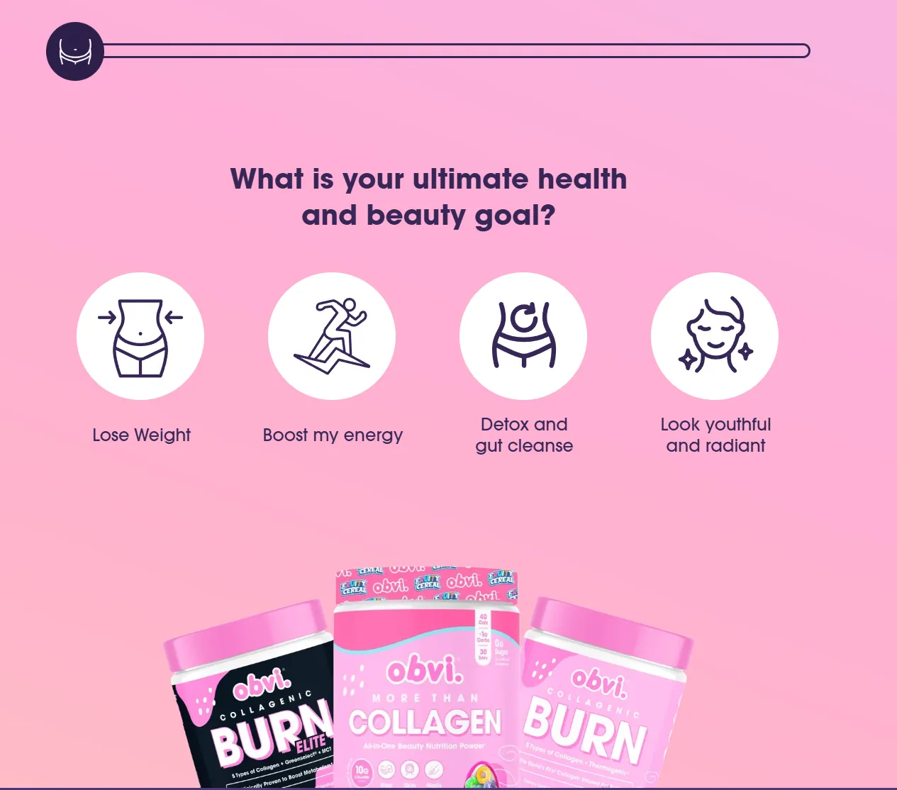
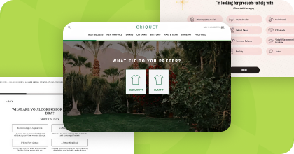
Rather than presenting a product and hoping visitors self-select, brands like Obvi use quiz landing pages to involve visitors in finding the right product. Obvi’s experience opens with a single question about the visitor’s health and beauty goal, then uses that input to shape everything that follows.
Instead of a one-size-fits-all web page, the experience adapts in real time. It feels tailored to the individual, not broadcast to a crowd, and that shift from presentation to guidance is what drives action.
Visitors don’t read; they scan for information that's relevant to their needs. Your headline needs to immediately answer:
The strongest effective landing pages eliminate guesswork. They speak directly to pain points and lead visitors toward a single desired action.
Generic headlines that could describe any product in your category lose visitors before they have a chance to engage.
Tip: Use action-driven verbs like “discover,” “find,” “build,” and “get.” Keep subheadlines focused on adding context, not repeating the headline. Test headline variations regularly, and evaluate them by traffic source. What works for a cold social audience often won’t perform the same for your email list.
Strong landing page design isn’t about aesthetics; it’s about direction. Every visual decision should guide users toward your call to action:
On mobile, this matters even more. Most landing page visitors are on mobile devices, so mobile responsiveness isn’t optional; it directly affects bounce and conversion rates.
IGK's quiz landing page is a good example of layout simplicity done right. It opens with a single question with no competing elements on screen. One question, one focus, zero friction.
Potential customers, especially new visitors, don’t yet trust you. That’s why social proof matters.
Reviews, testimonials, ratings, and real outcomes reduce hesitation and increase confidence. This is what turns traffic into paying customers and drives more conversions.
This is where most brands fall short. Generic landing pages treat every visitor the same. Personalized landing pages adapt based on what the visitor actually needs.
Through lead capture, quizzes, and segmentation, you can collect customer data and zero party data: high-value information visitors willingly share.
That data powers:
And ultimately, more relevant experiences that drive more sales.
The most effective ecommerce landing page optimization strategy right now is the quiz landing page.
A quiz landing page replaces passive browsing with active participation. Instead of asking visitors to figure things out on their own, a quiz presents targeted questions, captures their inputs, and delivers personalized recommendations.
This changes the entire dynamic. You’re no longer presenting products; you’re guiding decisions that lead to:
Instead of forcing visitors to navigate multiple product pages, a quiz landing page helps them quickly find the perfect product. It also improves customer experience by reducing friction and decision fatigue.
A quiz landing page works best when:
Pop-ups are often misunderstood, but when done right, they don’t interrupt your shopper; they convert. Exit-intent pop-ups capture visitors who are about to abandon the landing page, reducing bounce rate and increasing lead capture.
Timed and scroll-triggered pop-ups help convert engaged users who haven’t yet taken action. They can:
The key is alignment. Pop-ups should support the same conversion goal as the landing page, not introduce competing offers.
The best practices for building an optimized landing page focus on speed, mobile usability, clear focus, personalization, and continuous testing. Each of these directly impacts conversion rate and how effectively you turn landing page visitors into paying customers.
Page speed directly impacts conversion rate because slower pages increase bounce rate and reduce engagement. Even small delays can cause visitors to your landing page to leave before engaging with your offer.
Faster load times keep visitors engaged, improve overall experience, and increase the likelihood they complete the desired action. Prioritizing performance is one of the most immediate ways to improve results.
A high-performing landing page should be designed for mobile devices first, since the majority of traffic comes from mobile.
That means using simple layouts, limiting form fields, and ensuring every call to action is easy to tap. Strong mobile responsiveness removes friction and makes it easier for users to move from interest to action without hesitation.
An optimized landing page performs best when it is built around a single conversion goal.
When you introduce extra links, navigation, or competing offers, you dilute focus and reduce your ability to maximize conversions. A clear, streamlined experience keeps visitors moving toward a single desired action without distractions.
Personalization improves conversion rate by making the experience more relevant to each visitor.
Using zero party data, quizzes, and behavioral signals, you can tailor messaging, offers, and content to specific users. This creates stronger alignment with their needs, leading to better engagement, more leads, and higher-quality conversions.
The best ecommerce landing pages improve over time through consistent testing and iteration.
Testing different headlines, layouts, offers, and page elements helps identify what drives performance. Tracking the right key metrics allows you to refine your optimization strategy and continuously improve results.
To execute this effectively, you need tools that support personalization, interaction, and data flow across your tech stack.
Digioh brings all of this together:
This is how you move beyond static landing pages and start building experiences that actually convert. For example, Ranavat used Digioh to implement personalized on-site experiences and saw a 294% increase in conversion rate, acquiring over 3,000 net new subscribers in 90 days.
High-performing ecommerce landing pages don’t rely on design alone. They rely on relevance.
The more closely your landing page matches what a visitor needs, and the more clearly you guide them toward a desired action, the higher your conversion rate. The fundamentals still matter:
But the biggest gains are coming from personalization. The fastest way to implement that first purchase is through quiz landing pages and interactive experiences that turn visitors into paying customers faster.
Book a demo to see how Digioh can help turn your landing pages into your highest-converting channel.
Don’t settle for siloed tools. With Digioh, you get one powerful platform for pop-ups, product quizzes, onsite identification, and more—everything you need to personalize every step of the customer journey. Identify more traffic. Collect more zero-party data. Turn insights into revenue.