August 13, 2025
Steal High-Converting Ideas From Leading DTC Brands
Browse 50+ real examples of personalized marketing funnels you can replicate today.
Done right, an ecommerce quiz is like that super helpful store associate who somehow knows exactly what you need. It can guide overwhelmed shoppers to the right product, boost conversions, and hand you valuable zero-party data you can actually use.
But small mistakes in quiz design or timing can turn what should be a high-performing conversion tool into a frustrating user experience that drives shoppers away.
At Digioh, we’ve helped thousands of brands fine-tune their product recommendation quiz strategy, driving 2.8x higher conversions and collecting actionable data in the process. Below are the 10 mistakes we see most often, along with fixes you can put into play right away*.
*Your brand is unique, and your quiz should be too. While these are general best practices, we encourage A/B testing to find what works best for your specific audience, product mix, and goals.

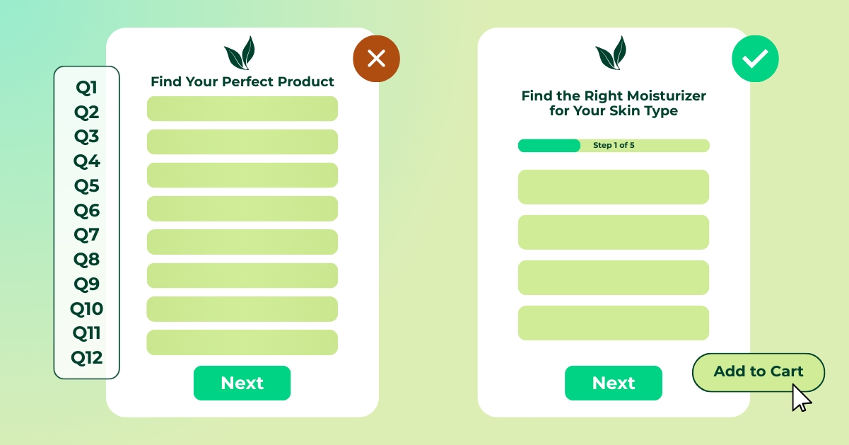
If your quiz tries to cover your entire product catalog, it usually ends up feeling vague. Shoppers want to know exactly what they’ll get out of the experience. A generic “Find your perfect product” quiz often sets expectations too loosely.
Zero in on one goal. Instead of trying to match someone to everything, focus on one category or need so your recommendations feel laser-targeted. “Find the right moisturizer for your skin type” instantly tells people what’s in it for them and makes it easier for you to deliver spot-on results.
It also simplifies writing the questions, building the logic, and making sure results match both your inventory and your marketing goals. If you have a big catalog, spin up multiple quizzes for different product lines
IGK Hair, for example, uses three different quizzes: one that matches shoppers to the perfect shampoo and conditioner; one that recommends the right hair color based on current tone and treatment history; and one that helps shoppers build their dream styling routine.

Long quizzes start to feel like a survey, and that’s when shoppers bail, especially on mobile.
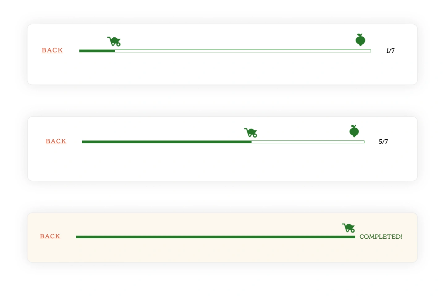
The sweet spot for most product quizzes is 5–7 targeted questions. This keeps shoppers engaged while giving you enough data to deliver personalized results. For more complex products, use branching logic so each person only sees the questions relevant to them.
Keep it short, add a progress bar so people know they’re almost done, and ask yourself if each question will actually help you give better results or improve future marketing. If it won’t, consider dropping it.
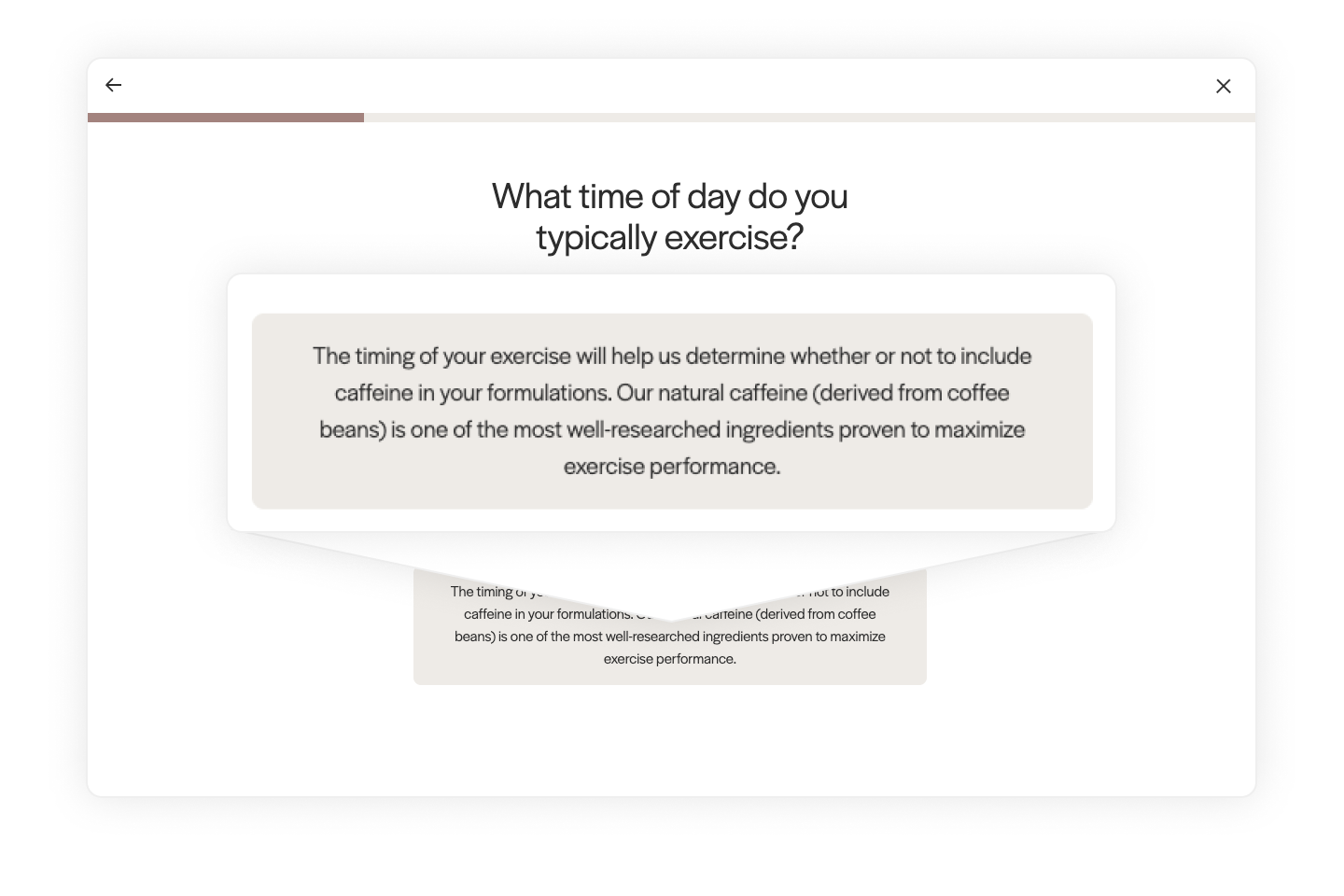
Complex, overly long wording slows people down. Shoppers should be able to understand and answer a question in seconds—not pause to re-read it.
Go for short and conversational. If something needs extra explanation, tuck it into a tooltip or “more info” pop-up so you don’t slow the flow.
Repeating questions—even if they’re worded slightly differently—wastes time and can be a root cause for quiz drop off. It also makes the experience feel less thoughtful and more like a generic form.
Audit your quiz for overlap and merge similar questions. A clean, intentional flow keeps the experience quick and keeps drop-off low.
If a shopper has to scroll through eight options for one question, you may be creating the decision fatigue your quiz is supposed to prevent.
Stick to 3–5 choices when you can, or use multi-select if multiple answers make sense. This keeps decisions quick and confidence high, which helps lift conversions.
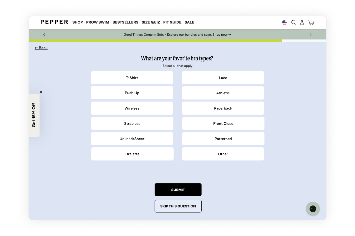
With more than half of ecommerce traffic coming from mobile, a quiz that’s clunky on small screens will lose shoppers fast. Slow load times, tiny buttons, or layouts that don’t adapt are all ecommerce quiz mistakes you want to avoid.
Build mobile-friendly quizzes with responsive design and touch-friendly navigation. Test on multiple devices, and use a no-code quiz builder (like Digioh) that ensures your layout, images, and buttons look great everywhere.
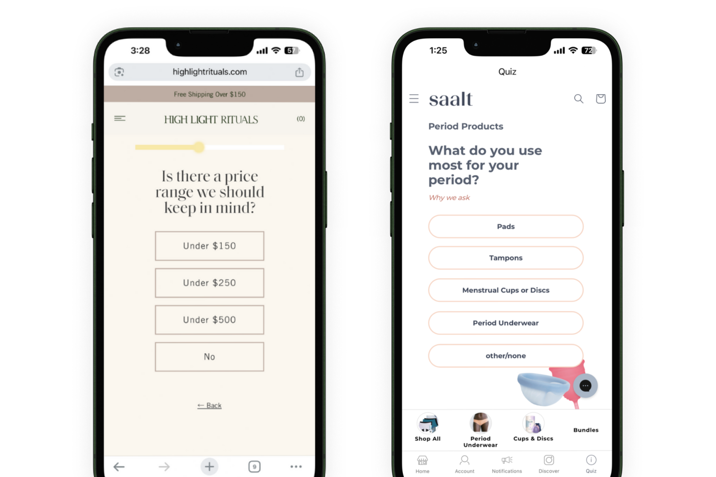
When and how you ask for an email address in a product recommendation quiz can make or break your capture rate. Ask too early without context, and shoppers may abandon. Ask too late, and you miss the engagement peak.
Put the form right before the results page, when curiosity is at its highest. Many brands see better opt-ins when they make it optional with a “skip and see results” button. This keeps completion rates high while still growing your list.
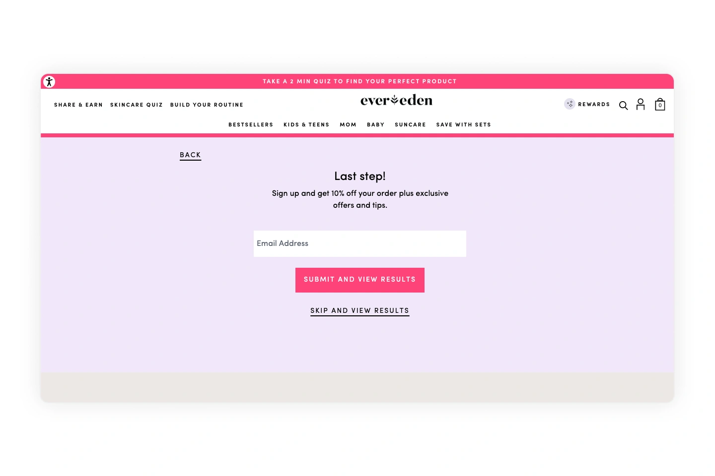
If your quiz delivers great recommendations but doesn’t make purchasing easy, you lose momentum and potential sales.
Add one-click “Add to Cart” buttons, direct links to product pages, or even bundle recommendations. The best quizzes integrate seamlessly with ecommerce platforms so shoppers can move from results to checkout in seconds helping increase conversion rates with quizzes.
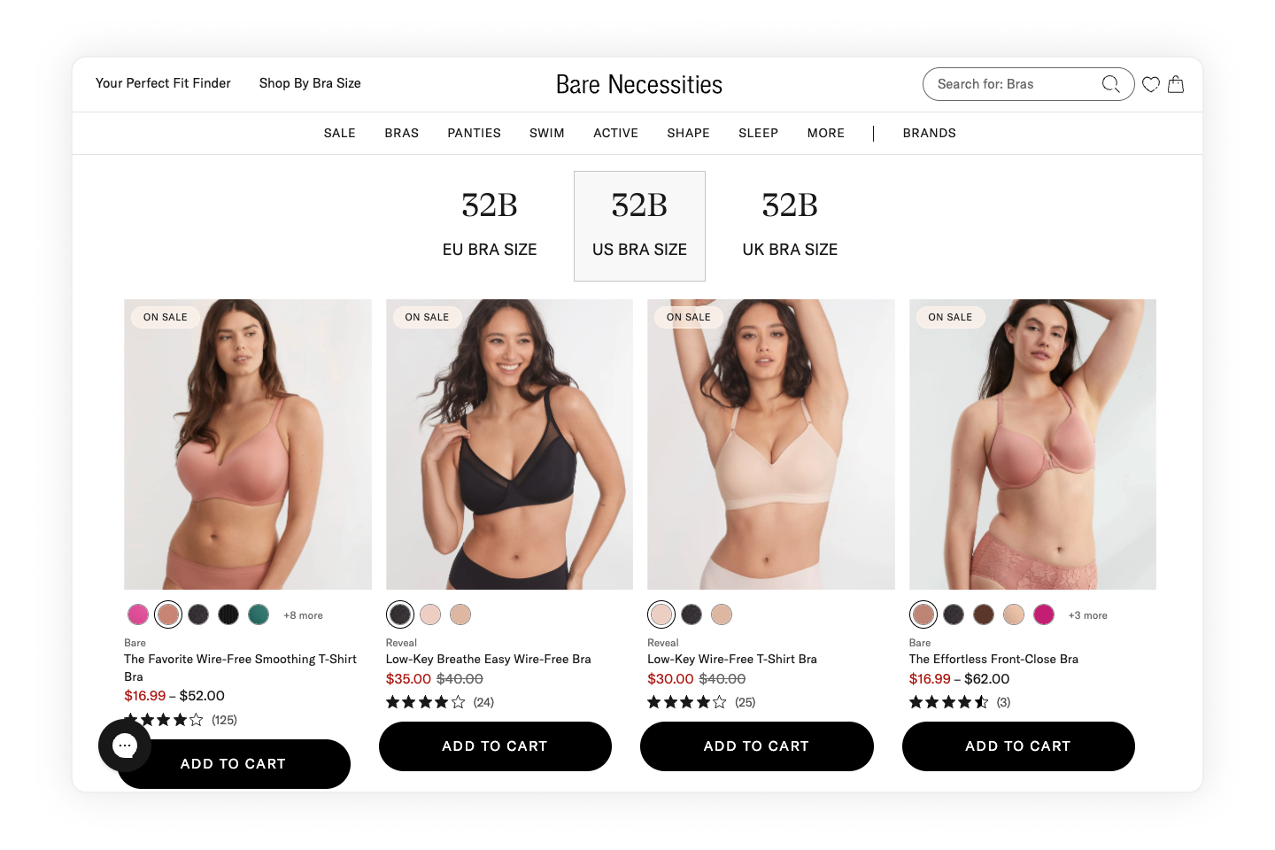
Even the best product recommendation quiz won’t drive results if no one sees it. If your quiz is buried in a footer link or hidden on a single landing page, you’re missing out on engagement and conversions.
Promote it like a featured product. Use pop-up teasers, homepage banners, and navigation links to guide visitors to the quiz. Strategic onsite placement is one of the easiest quiz promotion strategies to increase traffic and grow your list.

If your quiz data just sits in the platform, you’re missing one of the biggest opportunities it creates.
Sync quiz data to your email, SMS, and ad platforms. Use it for segmentation, personalized campaigns, and retargeting. When done right, your product recommendation quiz fuels both immediate sales and long-term personalization.
The right quiz is equal parts strategy, design, and execution—and that’s where Digioh comes in. Our platform helps ecommerce teams design engaging, mobile-friendly quizzes.
But quizzes are only part of the picture. Digioh’s Onsite Identification helps you recognize more of your site visitors by turning anonymous traffic into known, addressable audiences you can reach via email, SMS, and ads.
Combine that with eye-catching pop-ups, banners, and embedded forms, and you’ve got the tools to grab attention and guide shoppers straight to purchase.
Ready to see it in action? Book a demo and start building ecommerce experiences that convert.
Most quiz failures come down to poor targeting, unclear results, or a lack of follow-through. If the quiz is too long, too broad, or delivers generic recommendations, shoppers won’t see the value. Even a well-built quiz can fall short if it’s buried on your site or disconnected from your email, SMS, and ad campaigns.
Design with mobile-first in mind. Use responsive layouts, large tap targets, and short questions that are easy to read on small screens. Test on multiple devices to ensure images, buttons, and navigation all scale properly. Digioh’s no-code quiz builder makes it easy to optimize quizzes for mobile so you can focus on content instead of code.
Zero-party data is information shoppers willingly share—like preferences, goals, and challenges. When you sync this data from Digioh to your email, SMS, and ad platforms, you can create hyper-relevant campaigns and personalized product recommendations.
Treat your product quiz like a featured product. Use homepage banners, navigation links, pop-up teasers, social media, and even paid ads to direct traffic. With Digioh, you can launch onsite teasers, banners, and exit-intent pop-ups that drive more visitors into your quiz flow without disrupting the shopping experience.
For most ecommerce products, 5–7 questions is the sweet spot. It’s enough to personalize results without losing momentum. For complex or high-consideration purchases, use branching logic so each shopper only answers questions relevant to them. Digioh customers often A/B test different lengths to find the balance between conversion rate and data depth.
A great quiz is clear, concise, and visually engaging. It guides shoppers through a logical flow, ends with actionable recommendations, and makes it easy to buy—whether that’s via one-click add-to-cart, direct product links, or bundled offers. The best quizzes, like those built with Digioh, also connect seamlessly to your marketing stack so the insights you collect fuel ongoing, personalized campaigns.
Don’t settle for siloed tools. With Digioh, you get one powerful platform for pop-ups, product quizzes, onsite identification, and more—everything you need to personalize every step of the customer journey. Identify more traffic. Collect more zero-party data. Turn insights into revenue.

<script type="application/ld+json">{ "@context": "https://schema.org/", "@type": "BreadcrumbList", "itemListElement": [{ "@type": "ListItem", "position": 1, "name": "Blog", "item": "https://www.digioh.com/blog" },{ "@type": "ListItem", "position": 2, "name": "10 Ecommerce Quiz Mistakes to Avoid (and What to Do Instead)", "item": "https://www.digioh.com/blog/ecommerce-quiz-mistakes" }]}</script>
<script type="application/ld+json">{ "@context": "https://schema.org", "@type": "FAQPage", "mainEntity": [{ "@type": "Question", "name": "Why do ecommerce quizzes fail to convert?", "acceptedAnswer": { "@type": "Answer", "text": "Most quiz failures come down to poor targeting, unclear results, or a lack of follow-through. If the quiz is too long, too broad, or delivers generic recommendations, shoppers won’t see the value. Even a well-built quiz can fall short if it’s buried on your site or disconnected from your email, SMS, and ad campaigns." } },{ "@type": "Question", "name": "How can I make my quiz mobile-friendly?", "acceptedAnswer": { "@type": "Answer", "text": "Design with mobile-first in mind. Use responsive layouts, large tap targets, and short questions that are easy to read on small screens. Test on multiple devices to ensure images, buttons, and navigation all scale properly. Digioh’s no-code quiz builder makes it easy to optimize quizzes for mobile so you can focus on content instead of code." } },{ "@type": "Question", "name": "How does zero-party data from quizzes improve marketing?", "acceptedAnswer": { "@type": "Answer", "text": "Zero-party data is information shoppers willingly share—like preferences, goals, and challenges. When you sync this data from Digioh to your email, SMS, and ad platforms, you can create hyper-relevant campaigns and personalized product recommendations." } },{ "@type": "Question", "name": "How can I promote my quiz to drive more traffic?", "acceptedAnswer": { "@type": "Answer", "text": "Treat your product quiz like a featured product. Use homepage banners, navigation links, pop-up teasers, social media, and even paid ads to direct traffic. With Digioh, you can launch onsite teasers, banners, and exit-intent pop-ups that drive more visitors into your quiz flow without disrupting the shopping experience." } },{ "@type": "Question", "name": "What is the ideal number of questions to include in a product quiz?", "acceptedAnswer": { "@type": "Answer", "text": "For most ecommerce products, 5–7 questions is the sweet spot. It’s enough to personalize results without losing momentum. For complex or high-consideration purchases, use branching logic so each shopper only answers questions relevant to them. Digioh customers often A/B test different lengths to find the balance between conversion rate and data depth." } },{ "@type": "Question", "name": "What does a good ecommerce quiz look like?", "acceptedAnswer": { "@type": "Answer", "text": "A great quiz is clear, concise, and visually engaging. It guides shoppers through a logical flow, ends with actionable recommendations, and makes it easy to buy—whether that’s via one-click add-to-cart, direct product links, or bundled offers. The best quizzes, like those built with Digioh, also connect seamlessly to your marketing stack so the insights you collect fuel ongoing, personalized campaigns." } }]}</script>