May 3, 2021
If your forms aren’t mobile-friendly, you’re probably missing out on conversions.

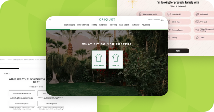
Steal High-Converting Ideas From Leading DTC Brands
Browse 50+ real examples of personalized marketing funnels you can replicate today.
According to data presented by Statista, the percentage of web traffic from mobile devices is on the rise, hitting an all-time high of 54.8% in the first quarter of 2021.
Unfortunately, mobile conversion rates still lag behind that of desktop.
Why?
For one, mobile page speeds. How fast your website loads matters, especially on mobile. In fact, even a one-second delay in mobile load times can impact mobile conversion rates by up to 20%!
But all the page speed improvements in the world won’t help a poor mobile form experience. When web forms aren't designed for mobile screens, users must pinch, zoom, and scroll around the screen to fill in forms. It’s not a great experience, causing some users to abandon the form in frustration before converting.
Bottom line: if your forms aren’t mobile-friendly, you’re probably missing out on conversions. Fortunately, there are ways to fix that. Here are 6 mobile conversion rate optimization tips that you can implement in your forms to convert more mobile users.

Mobile design prioritizes usability on smaller screens. To give your mobile users the best form experience, use a form builder that offers mobile-friendly pop-up templates, or follow these guidelines as you build your mobile forms:

If your pop-up solution allows you to target users by device, you can trigger completely different versions of your forms for different devices. This allows you to create larger, more intricate designs for your desktop audience while still showing forms that respect the user experience of your visitors on mobile.
Creating separate versions of your pop-ups for different devices can also help you track desktop vs. mobile performance.
If you do create separate forms for different devices, make sure your mobile-only form follows best practices!
On desktop, websites use exit-intent pop-ups to trigger lightboxes that appear when a visitor moves their cursor out of the browser window. These lightboxes tend to earn high conversions, but how do you replicate that success on devices where there isn’t a cursor to track?
Instead, use idle timers to trigger a pop-up after several seconds of inactivity.
These timed pop-ups can help prevent browse abandonment, but the right pop-up content can also help your visitors. Sometimes, users may go idle on your site because they’re not sure where to go next. Use these idle pop-ups to guide your visitors with helpful information:
By delaying your mobile pop-ups until visitors go idle, you can also respect your mobile users by not bombarding them with pop-ups as soon as they hit your site.
If you use your website to grow your SMS list, it’s important to give these potential new subscribers the best mobile experience.
With one-tap opt-in buttons, visitors can opt into your mobile messaging without having to fill out a form at all. One-tap buttons work by populating an opt-in text in visitors’ native text messaging app. All users have to do is hit “send” on that message, and they join your list.

Remember to include all necessary compliance text in your mobile opt-in paths to ensure your SMS program remains compliant with TCPA and CTIA guidelines.
Digioh allows you to build mobile-friendly SMS opt-in forms that integrate with all leading SMS marketing platforms, including Postscript, Attentive, and Klaviyo.
The more fields in your form, the less likely a visitor is to complete that form. This is especially true for mobile, where tiny screens make completing multi-field forms tricky.
If you need to collect additional data from your visitors, use progressive multi-page forms. These forms can help you improve the mobile experience by capturing data now and allowing visitors to provide more information later, if they wish.
For instance, the mobile form below collects the email address first, then asks visitors if they would like to opt into text messages. If so, the form triggers the one-tap mobile opt-in text path mentioned above.

Digioh’s progressive mobile forms submit data at every step of the form, allowing you to collect data, even if a visitor abandons the form before reaching the last page. This way, you can collect an email address without forcing visitors to provide their mobile number or other data too.
What works for your desktop audience doesn’t always work for mobile visitors. A/B and multivariate testing can help you identify the creative and tactics that best resonate with your mobile audience.
Here are a few ideas to test in your mobile forms:
There are near-endless possibilities for optimizing your forms with testing, so make sure your mobile form & pop-up solution provides the testing capabilities you need to maximize conversions.
For instance, with Digioh’s multivariate testing, you can test multiple form variants against each other, control the percentage of your audience that sees each version, and automatically deploy the winning form to the rest of your audience when your test is complete.

As you optimize your site to cater to your mobile audience, don’t forget about your forms and pop-ups! If you need a form builder that allows you to build better mobile pop-ups, we can help. Digioh’s drag-and-drop builder allows you to create forms, pop-ups, surveys, and more that look great on any device. Take a tour of our mobile-friendly pop-up builder, and take the first step towards improving your mobile conversion rate.
Don’t settle for siloed tools. With Digioh, you get one powerful platform for pop-ups, product quizzes, onsite identification, and more—everything you need to personalize every step of the customer journey. Identify more traffic. Collect more zero-party data. Turn insights into revenue.
